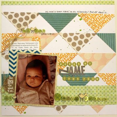
I, like Lisa, had a story to tell for every one of the ideas I posted about last week... But this has been on my "to do" list for a long time, so it was time to focus. I will get to the other stories someday and I promise to add and tag them on the flick'r gallery.
In the meantime, here is my accomplished story.
the design was inspired/lifted from this wonderful layout by Emily Spahn {here}
I debated with whether the photo should be of me present day, a collage image with my namesakes or a baby photo. A baby photo won out because I decided I will be placing it in my baby album as part of the stories of when I was born.
I had to get creative with my alphas but I loved the repetition of the gray color and this one was the only gray alpha I had which was missing some key letters.
Here is the printed journaling card outside of it's pocket for your reading pleasure. Fun story, huh? More on my namesake {here}
and here's a peak of how the journaling looks in it's home. It is meant for reading so I left enough of it peeking out as to invite others to pull out and read more. I placed it in an envelope for the aesthetics I was trying to portray and not because it is private journaling. So I wanted to make it obvious.
Pleased as punch with this one, mostly because of the trivial yet important story it tells.


Another piece of the puzzle for me! I knew half this story so I'm delighted to hear the other half - the bit with your mum! Love this layout and weren't you just THE most adorable baby? Oh my! Just delightful! I love the journalling treatment with that cute little envelope and the whole design is just great.
ReplyDeleteI will have to quiz my mum again about why she wanted my name and make my layout. Thanks for a great prompt!