I think my problem is often in the execution of my prompts - I often immediately have a story or an idea, even think about which of my kits to use that might have the ideal colours etc but then, I come to a standstill. I have to find photos. Or take photos. Or think about where the memorabilia is. Or make something that isn't for an assignment so that it can be shared.
All excuses but this really is often the case.
For the Tiffany Blue prompt - WM#204 - I had so many stories that it sort of inhibited me to actually pick out a photo and product and get going with it. In the end, I decided to just take a photo to match where it all began. And take it from there.
The result is this page.

A few things to note here. First up, this is the first page I've made just for me, not using a kit for a LONG time! Usually, when I scrap, I use my Scrapabilly kits or my Counterfeit Kit Challenge kits and am "limited" to using what's included in those kits. Sometimes, the stories I want to tell don't match the feel the papers or products have and I get hung up on not telling the story until I have those "right" colours or patterns. To be honest, this is one of those stories. But then I spotted the brand new Pinkfresh Studio papers that I'd just picked up at Scrapabilly and decided that I had to find a way to use them to tell this story. Just because I wanted to. They are new and pretty and were calling my name.
Then there was the photo itself. Not particularly stellar but made better by using a filter and a bokeh effect but which adjusted that Tiffany Blue to much more of a blue! I don't know if you have the same discussions with the men in your life, but mine swears this particular blue is more of a green and as you know, Tiffany certainly doesn't call it Tiffany Green! But he would definitely approve of the blue in the photo.
I matched up the photo with some of the simpler patterns found in this collection and then realised just how green that paper was in the background. Funny - I have a photo that's too blue and a paper that's too green but I really wanted to give a nod to the original tone of that infamous packaging.
The tissue paper confetti which I punched from the Scrapabilly wrapping came to the rescue and matched up with the box and pouch perfectly. I guess I could say that this fulfils with the current Whimsical Musings prompt WM#215 to use tissue paper too!
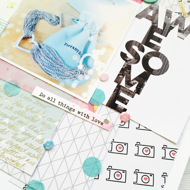
I had treated myself to several of the items in the collection including the puffy elements and this half-gold frame is so gorgeous that I just had to use it straight away. I kept the journalling in subtle gold so that it didn't distract too much from the design and the pretty photo.

That little heart embellishment was also a perfect match to the Tiffany Blue and the messy gold thread softened up the more linear feel to the papers I'd used.

I'm sure I have more to share so I'll see what I can find and post again soon.
Thanks for dropping by.
Oh, how wonderful to treat yourself to some scrappy FUN!
ReplyDeleteI love the new products you chose for this layout - could that half gold frame be anymore LISA?!? :D
What a great memory written down of that period in your life, and a FAB "momento", hehe...
I think I may agree with Ralph after I did my Tiffany layout - I'm afraid it leans more to green than blue.
Make a note to self, Lisa. DO THIS MORE OFTEN <3
It is a sweet layout :)
ReplyDeleteVery pretty layout! I love the tissue paper confetti--definitely going to use this on a page of mine!
ReplyDeleteFirst of all, that is a gorgeous piece of jewelry!
ReplyDeleteThe layout is lovely as well, with delicate details that complement the photo. Love that half-gold frame - definitely perfect for the page.