 |
| Sketch courtesy of Page Maps September 2011 |
In the end it turned out unpretty and hopefully, a bit boyish instead of the pretty girlie layout I'd had in mind when I first saw the sketch!
 |
I decided to make a second layout using the sketch because I wanted something prettier!
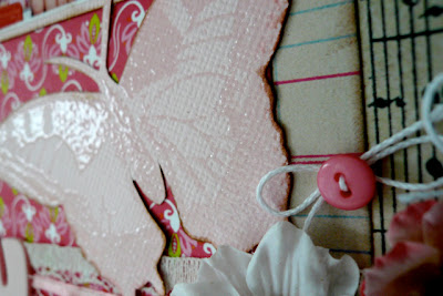
I created the clear embossed background as part of a CKC challenge and kept the "stuff" on top of it to a minimum so that it would show through. I just thought the butterflies were so pretty.
One of the things I love the most about this sketch is the row of photos - you know how I love the multi-photo layout - and when I looked at all that pink, I thought of my (somewhat Diva-ish according to her mum) niece! Photos spanning the years. Perfect.
Lisa
x


No comments:
Post a Comment
We <3 comments!