Showing posts with label Color. Show all posts

Monday, 13 May 2013

#89 Inspired by tone-on-tone

I got the idea for this layout early on in the week after revisiting the page with the paper waves from last week. I wanted a lot of orange on orange.

although my vision didn't become a reality, I do like the tones of orange on this page and all the small elements that add dimension to the orange. 


The black and white pictures (you know I can't resist a photobooth) made it an easy addition to the busy background which was my starting point. I added a little of the teal glitter tape to add another color to the layout. Orange and grey just seemed too sad for this happy page. 
 

the addition of that grey paper was a given once I chose a theme for this page. The graffiti-like messages on this gorgeous paper really reinforce my story - my hidden and visible journaling have the same feel. I love it when things like that fall into place.


I added some foam dots to a lot of the embellishments to create that separation of layers and the distressed edges also helped with this.

I hope you find a way to be inspired by this. I feel this is also a good way to use up stash of a certain color because you can add a lot of elements of that color into the layers. Can't wait to see what you all come up with.

xo,
Pamage

Monday, 6 May 2013

Challenge # 89 - Week of May 6th 2013

Whoa! Hey there. We are already in May. Crazy how fast this year is flying by... Happy National Scrapbooking day, y'all.

But you didn't come here to hear about my year. We are here for scrapbooking challenges with a whimsical twist. And because I know a lot of you are probably participating in LOAD or NSD challenges around the web I decided to keep the challenge simple so you can incorporate this into other projects you may be working on.

So - your challenge this week is to use tone on tone on your layouts. And I found some examples from my own arsenal to share with you and get you started on some ideas

* use tone-on-tone die cuts over paper strips of the same color family

* use tone-on-tone by stamping designs with same color ink as paper

* use tone-on-tone with lots of buttons over a painted strip on your paper - through in some tone-on-tone brads and embellishments for extra whimsy
*add tone-on-tone strips and scraps of the same cardstock over your background to create interest and texture without compromising white space

I hope this has given you a starting point for your layout. I can't wait to see what you come up with. Remember to add it to our gallery with the tag WM#89.

xo,
Pamage


Tuesday, 9 April 2013

#84 inspired by the ombré trend

I know! I'm late. I'm a bad scrapper and a very bad blogger at the moment. Big apologies.

I'm trying to catch up but honestly, where does the time go?!?

I did manage to get a layout made yesterday evening though and that was a good thing. It's a great stress reliever and I'm in need of that right now :-)

So, I challenged you to take up the ombré trend and get colourful.

Whenever I put these prompts together, I'm rarely organised enough to actually think about HOW I will make mine and I certainly didn't have any papers in mind. So it was pure luck to open up my April Counterfeit KitOpposite,  and discover a selection of creams, yellows and oranges which seemed to be calling to be put together. This was most definitely not planned but such a pleasant surprise.

I've been missing using lots of paper on my layouts recently so I decided to just select a group of papers, cut them into strips and use one of my favourite border punches in order to get a large block of colour on my page. I placed them all a bit off kilter to make it look less structured and quite like the higgeldy piggeldy look to it.

After laying them out on the page, I decided that the page didn't need much else. The kit didn't have much that fitted the look I wanted to achieve so I settled on a few resin roses, a couple of über-old rub ons including a Doodlebug alpha which must be four or five years old, and some pearl sprinkles. A few glitter mist splats finished this off.

Counterfeit Kit Challenge kit - Opposite - layout #2


My journalling is minimal but heartfelt and the photo is one I adore so you can be sure to see that again and again on various layouts.

I loved seeing the ombré effect appear with the papers and I will be trying this again - practice makes perfect I think!

We really hope you share your colour choices over at our Flickr gallery (here) with the tag WM#84

Sunday, 20 January 2013

#73 - inspired by organization

It is ironic than on organization week I feel more disorganized than ever.

I guess that is how it works.

I had to really pull it together this week to bring you a layout and so I changed up the size, used only one photo and kept it super simple. But I got it done. If you have been struggling to kick start your creative year I suggest you give yourself a break and keep it simple until you find your groove again.

And here is my page.


and there you have it. I hope you found some time this week to get your Whimsical Musings layout checked off your to-do list. *wink*

xo,
Pamage


Sunday, 16 December 2012

#69 Inspired by Non-traditional color schemes

I tried to keep it simple this week again and with how hectic life these days that was just what the doctor ordered. 

All these blues and greens chose my theme for me : Blue Christmas.

 
This will be my first Christmas without my friend Steve. This week I got an ornament in the mail with the card tucked in the layout. This clearly made me sentimental so with a quick collage of Christmases past and a load of blues and greens I created this quick page. Hope you're enjoying your Christmas and cherishing every moment you have to spend with loved ones.

xo,
Pamage

Monday, 10 December 2012

Challenge #69 week of December 10th, 2012

Well, that most wonderful time of the year is well underway in my part of the world. Parties, gatherings, shopping, planning, traffic, busyness and more. But a lot of us still need that little alone time at our work desks in order to maintain our sanity (if we can manage it).

So whether your are overwhelmed with all the red, gold & green or you just need a little jumpstart to your creativity, your challenge from this week actually comes from Paper Trey Ink and it is a non-traditional holiday color scheme.
Inspiration from {papertreyink.com}

So try to use this color combination in your projects this week. Think outside the box and don't limit yourself to just layouts. Whether it is a holiday card, a present wrapping, a home made plate of cookies, a handmade gift or other project, the possibilities are endless.

If you are so inspired by these colors, remember to share with us over at the gallery. We would love to see what you are up to this season.

xo,
Pamage


Sunday, 11 November 2012

#64 Inspired by Babies

Every once in a while you create a layout you just LOVE.  I mean, you just want to look at it and share it with others and not put it away just yet...

Well, at least that happens to me. Sometimes. And that happened with this layout. 

I will confess that I am intimidated by all things pastels. Especially pale pink and pale blue. Together they are even more of a nightmare for me. I don't even own any baby product lines. So I was a little skeptical of how I could make this prompt my own. It is NO secret that I love babies. Although I don't have any of my own, I have plenty of little ones to scrap. But how to make the topic fit my style? I have scrapped plenty of babies before with no problem, but I felt this prompt required an especially baby-feeling page. 

Well, the scrapping muse must have been feeling friendly this week because I did it. And this has become one of those pages I just adore. 


that's right. Only one page this week. 

The color scheme came from the 6x6 paper from the new Dear Lizzy collection. From there I was inspired to recreate those polaroid frames to hold my pictures and washed them with watercolors in the same colors as the frames. This allowed me to better define the groups of photos in the collage since they are grouped by color. The washi border allowed me to inject some bolder shades of the same colors to add that touch of my style. For the title, I layered a bunch of scraps in my colors for a bit of dimension and mixed some fonts in bold colors and some tone-on-tone fonts. To finish it off I sprinkled hearts and glass stars. 

My favorite thing about the page is that I got to tell a real story about my life this year and summarize a big part of 2012 in one page. Plus, I have all those adorable pregnant bellies/baby pictures. I dare you not to smile. 

Hope you were able to be inspired by Lisa's invitation to scrap babies this week. We would love to see your layout on our gallery. 

xo.
Pamage

Tuesday, 16 October 2012

#60 Inspired by Autumnal colors

oopsie daisy - i forgot to post my layout. Oh well, here it is a day late.

as I mentioned before, I am participating in LOAD and it has been quite fun to follow the prompts this time around. One of the prompts pushed me to re-visit a technique-gone-wrong and I remembered wanting to scraplift this lovely layout by Shannon Tidwell {here}.

So I did and the photo I chose to showcase went wonderfully with the beautiful color combo Lisa picked out for us. Although she probably had in mind some autumn pages when she chose it, I think it is funny how both of us chose to scrap non-autumn pages altogether.


what I love most about this page is the message of hope and the breezy feeling of the butterflies mixed with the calming nature of the colors helps convey that.

this page means a lot to me emotionally. I want to thank Lisa for the inspiration.

And thank you all for being with us week after week.

xo,
Pamage

Monday, 8 October 2012

Challenge #60 week of 8th October 2012

Hi everyone.

It's a good job I checked into this pre-written post to check it out before I posted it. I'd written it weeks ago in an attempt to get ahead and now I find there's just a photo and a line of text. Oh boy, my brain is frazzled right now!

Anyway, I know that some of us are trying to complete LOAD1012 right now and I certainly have enough to keep me out of trouble so I thought I'd give us an easy prompt. And it's that wonderful time of the year at the moment that makes me smile every single day.

So put the two together and here's what could be taken as an autumnal colour scheme to play with.


Colour scheme found at Design Seeds

It's late, so I'm keeping this short and sweet!

I have managed to complete three WM prompts this week via LOAD (this week's and two older ones) so I will try to get them posted as soon as I can :-)

We'd love to see your creations over in our Whimsical Musings Flickr gallery {here} with the tag #WM60.

Have a great week everyone! I'll be thinking of you all in moments of peace! Ha Ha!

Sunday, 19 August 2012

#52 Inspired by past challenges

I can hardly believe we have been doing this for a full year. Looking back I am amazed that this little venture has added 52+ stories to my efforts to document my life and that of those around me.

In clicking through each prompt I was again reminded of all the great challenges we had throughout the year... and some I wanted to take on again. I couldn't narrow it down, so I ended up creating 4 new pages! And that in itself should be cause for celebration.

dream big & dare to fail

for this layout, I took on Challenge # 2 to be inspired by Norman Vaughn's motto of "dream big & dare to fail". The first time around I had been intimidated by the boldness of his words and ended up making a trivial layout. This time I wanted it to have more oomph and true meaning to my dreams. But alas, I am still not daring enough to put them out into the universe, so they sit in a little pocket for my eyes only. The layout was also inspired by this recent pin {here}.

we go on the best dates 

For this layout I wanted to take on my own prompt, Challenge # 13 to be inspired by a triadic color combination. I decided to do one I hadn't done before, red-yellow-blue. When I think of those colors I think Elementary School and boy toys. So I was interested to see if I could pull it off with this goofy picture and I think I succeeded. The sketch came from October Afternoon's blog {here}.  Another cool element of this page is that I was able to use the menu from the restaurant right in the layout.

love life

I had been itching to re-do this prompt and do it justice probably since I first took it on. Challenge # 23 was inspired by my new room decor, but my initial resulting layout didn't have the feel of the room although it used the colors. I recently bought a 6x6 paper pad - MME's tangerine collection {here} and it had the perfect colors. (here's a little known secret about my work: I use a lot of 6x6 paper pads). I added a few more touches and turned out the perfect layout reminiscent of my room.

momofuku

for this layout I revisited Lisa's Challenge # 30 to be inspired by the current trend of geometrics. Although hexagons were all the rage a few months ago when this prompt first came out, these recent pins prove that the new trend is triangles {here & here} or maybe just coincidence.

Overall, I had a blast going over past challenges as looking at how I have evolved as a story teller. Thank you for all your support and I can't wait to start another year with tomorrow's prompt.

xo,
Pamage
ps: remember that you have until the end of the month to upload a layout to the gallery using the tag WM#52 for a chance to win a prize. 

Saturday, 11 August 2012

#51 - Inspired by Live Colorfully

hey there gals. Posting a little early this week as I have a weekend of "living colorfully" ahead of me. I am still waiting for those photos of you guys wearing bold colors. But in the meantime, I will share the layout I created for this prompt.

I am sure more stories will come down the road for his one, but in the end I decided to make a page about how I embrace this motto in my own life. I love making pages that gather random photos with no story and tie them together with a title and some simple journaling. To me, these stories are more significant than event pages because they paint a more complete picture. The pictures used on this page span 4 years and yet they fit together nicely. 

Enough chatting, though, let's get on to my page.

 
I kept the colors and patterns to a minimum because I didn't want to overwhelm the photos as I really wanted the story to shine. With a prompt like "live colorfully" you would expect me to use bold and bright colors. And while the page is quite happy, the colors take second plate to everything else going on.
 
I knew I would never find an alpha with 4 l's, 2 o's and an e, so I didn't even attempt it. Plus, I was starting to miss my watercolors. I drew up my words with pencil and then traced over them with a brush, mixing colors as I went to create this ombre look. I then outlined it with my precision pen and when i realized my pencil marks wouldn't go away {embracing imperfection}, I added my white gel pen.
 
I added my journaling straight onto the cardstock {being bold} before I realized that it didn't really tie in to the title, so I added the little yellow strips to bring the two together. 
 I hope you enjoyed thinking of ways to interpret this prompt. I really do hope you are all finding ways to live more colorfully. If you create a page we would love to see it, so please remember to share on the gallery and tag it (WM#51). Check back for a new prompt soon.

xo,
Pamage

ps: did anyone notice? no splatters. I wonder if that phase is over for me. probably not! ;)

Monday, 6 August 2012

Challenge # 51 - Week of August 6th, 2012

Hello! Welcome back to our little blog {who is almost celebrating it's one year anniversary}


the prompt for this week was born Sunday morning as I was in the car playing co-pilot, DJ and toll funds administrator. I looked down at my lap and noticed this message on the inside of my phone cover pictured below. Then I simultaneously noticed my nails, wallet and pants - and chuckled to myself. I kid you not, this photo was not staged in any way. I was wearing bright yellow pants, "Who the Shrek Are You" nail polish and had my purple wallet and pink Kate Spade phone cover out. Coincidence? Totally. Surprising? Not at all.


So you may have guessed it, your prompt this week is to be inspired by the phrase "Live Colorfully". In compiling my monthly collage of photos on my personal blog {here} I came to the realization that I lead quite a colorful life. The colors and patterns I use on my pages surround my everyday life. Polka dots, stripes and whimsical flower prints in all my happy colors cover everything I own. Clearly this prompt will not be hard for me. 


But if you are intimidated by color and your personal style or house decor is more muted beiges and classic whites, then I challenge you to consider these additional ways in which you can indeed live colorfully. Both prints below, as well as the slogan, belong to Kate Spade and her line. 


Live Colorfully
Live Colorfully

... and this one
Live Colorfully
Live Colorfully

I love all the ideas in the second print. So you don't have to limit yourself to just dressing or decorating with bright colors. The concept of "colorfully" is much bigger than that and I truly live to embody it. Let's take a little time this week to examine how we or those around us put this into practice.


I cannot wait to see what you all come up with this week while we celebrate our more colorful sides. And in the spirit of celebration, wear something colorful this week and share with us! Remember to tag this as WM#51 and check this space next Sunday for our interpretation.


xo,
Pamage

Monday, 11 June 2012

Challenge # 43 - week of June 11th, 2012

Wow, is it just me or are these warmer weeks just flying by?

Today, I want to share with you one of the pages I recently created and love - and the source for inspiration.


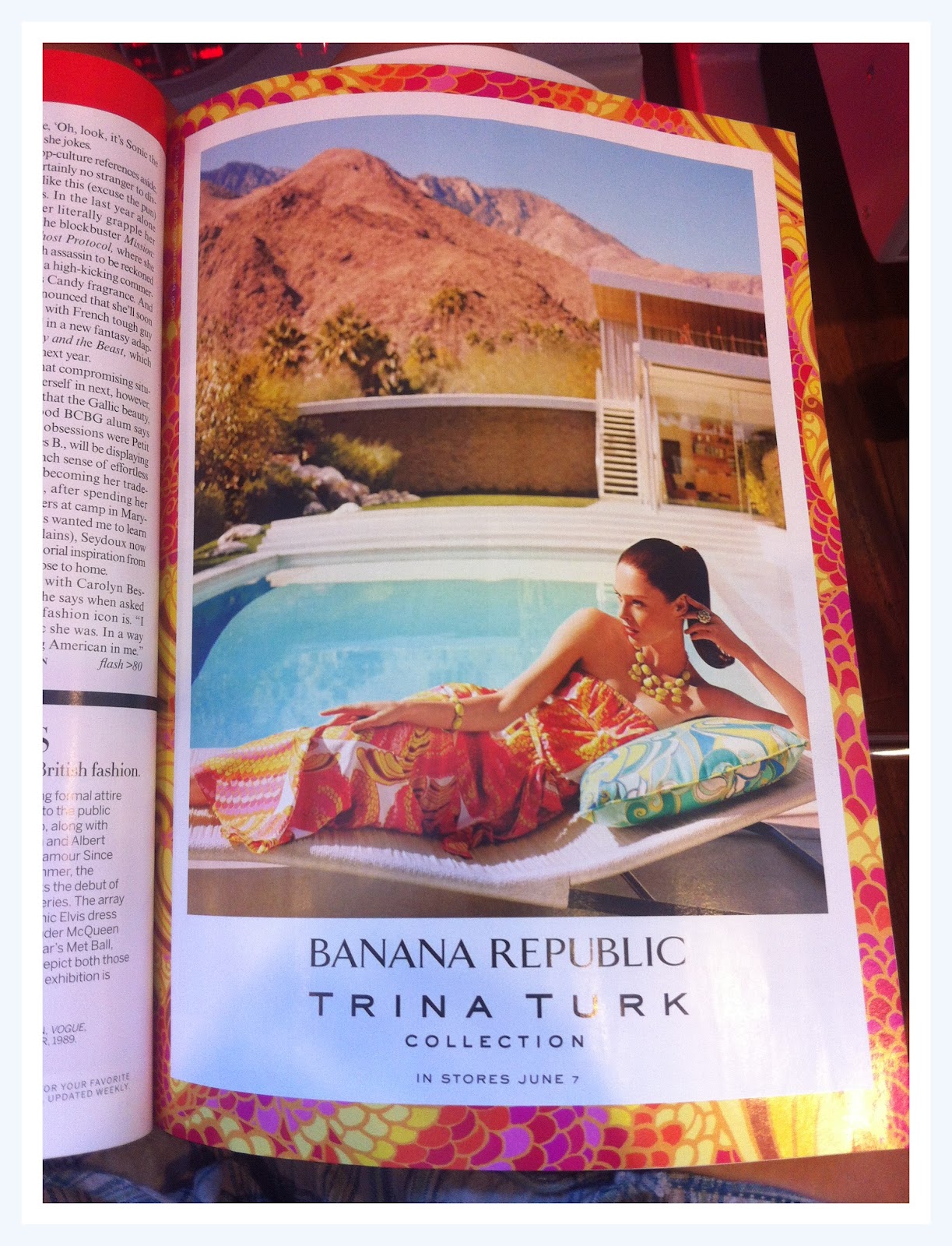
if you know me by know, you know I almost exclusively scrap on a white background. Anything else feels cluttered and off to me. So you may wonder how it is I came upon this choice of background? I was inspired by the ad from a magazine photographed below.

you can easily tell that i picked up the layout composition, color pallete including the accentes in white and black, the title color and placement; even the little bobbles were inspired by the model's earrings. One of the smartest things I ever learned from Stacy Julian was this - media ad artists are paid to do this. They have gone to design school to make things that are visually pleasing to us. Why not use this free inspiration that is readily available to us?

Well, you may have guessed it, but that is our challenge for this week. But I know some of you may be saying, 'yes, but Pam, how do we find an ad we can easily break apart like you did?' or 'Pam, I don't even buy magazines'. I don't buy magazines either, but this is what I do while my nails dry at the salon - I flip through the magazines, not for celebrity gossip, but for future layout ideas. And lucky for you I have a few still sitting in my inspiration file on my computer that I haven't used. So to start us off, I have two inspiration pieces for you. 

Inspiration Option # 1
Banana Republic Ad

Inspiration Option # 2
Sally Hansen Ad
I hope you can draw some inspiration from these two ads and that is eases the process for you to create. Even if just lifting the color scheme or title placement of photo placement, try using these ads for inspiration and see where it takes you. 

If you do create based on these ads, please upload it to our flick'r gallery {here} with the tag WM#43. Lisa and I will be back next week with our results. Like always, thanks for playing along.

xo,
Pamage

Monday, 16 April 2012

# 34 Inspired by Tablescapes

Lovely ladies,
clearly our Lisa is the master of all things pretty and pink. I loved her tablescapes and was clearly inspired by all the pretty Easter colors.

I decided to just put together the base for a page inspired by the colors and then add photos. This allowed me room to play, which is what I was going for this week.


I added the brads in both corners to drive the eye around the page.

I also had a bunch of brads still on my desk from last week's prompt and decided to use them up in a row

I mounted the photos on craft cardstock which I distressed a little.

Thanks for playing along for another week.

xo,
Pamage

Sunday, 15 April 2012

#34 Inspired by Easter photos full of prettiness

Phew - what a week.

Last weekend was busy with family and filled with chocolate - most of which was brought back with me to hoard for times when I "need" my Cadbury fix. And since I've been back, I've been busy with stuff I can't share just yet but let me tell you that I have been cutting and gluing and sanding and inking all week.

But I managed to find time this evening to put together a little page from my challenge to you last weekend.

I wondered if I should make it more difficult for myself, perhaps taking the challenge is a different direction but in the end, decided to just use one of the pretty photos I'd posted and wrote a few lines about how I feel about decorating for my Easter dinner as well as mentioning a little cultural difference over here.

I scattered a bit of journalling around my page à la Pam but still need to practice that! I used my April Counterfeit Kit, Blossom, with its full-on colour palette and just played with layers and pretty stuff.


I'd like to get around to making another couple of pages with the other photos but we'll have to see how that works what with LOAD coming up and various other commitments. Another list of layouts to be added to my inspiration list I suppose!

If you had time to create this week, do share with us over at Flickr with the tag WM#34. How pretty can you go?

Monday, 9 April 2012

Challenge #34 week of 9th April

I'm scheduling this post ahead of time as I should be on the road right now as this goes live, heading home after an Easter break. I know that we are lucky in Europe to have two Bank Holidays for this and the four day weekend is always a treat :-)

So, I'm sitting here with a To Do list as long as my arm of bits and pieces to get one in the next 24 hours feeling a bit sorry that I'm not doing my usual über-pretty Easter table decorating this time around. We often have a large family dinner on Easter Sunday or Monday and I like to go to town with the pink, fluffy decorations - seems appropriate somehow!

And then I thought that all that prettiness shouldn't go to waste. Therefore, in honour of Easter bunnies, I'm posting a few of my over-the-top favorite Easter photos for you to use as your inspiration :-) I'm interested to see which bit you'll take into your creating this week.

Short and sweet - ready, steady, get scrapping :-)


Share your creations with us over in our Flickr gallery with the tag WM#34.

We love seeing the contributions that you share with us each week - each of you makes both of us very happy :-)

LinkWithin

Related Posts Plugin for WordPress, Blogger...